Hey all, thanks for taking al ook at my blog. I am new at this whole blogging thing so if I make any mistakes feel free to leave me some feedback.
A bit about me: I enjoy looking making and reading reviews, I am online frequently so I may update this blog regularly (once I get used to the whole blogging thing), and I enjoy writing and expressing myself in the form of an online critic. I do what I can to keep myself from being biased and I try to remain as neutral as possible.
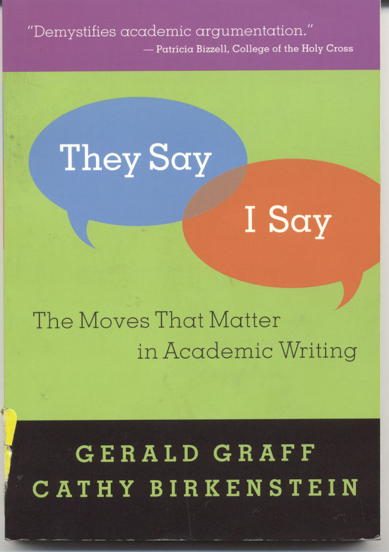
Well now that introductions are out of the way, I'd like to dig into my first bit of subject matter, my college required reading material, They say I say. I havent read the whole book yet, so I won't start venting about what it may say in there. But if it's anything like the cover, this quarter is going to be painful. Here is a link to what the book cover looks like.
http://web.cecs.pdx.edu/~sheard/course/Design&Society/winter/Docs/TheySayISay.jpg
The first thing i would like to point out is the color choice. Bland, unapealling and overall hard to look at. Undo my experience, the cover of a book is meant to be a summary of what the book is about and try to draw the reader in before they have even opened the book. For example, say I'm looking through a pile of books at a library looking for something interesting. If I saw this cover, I would just push it out of the way and continue looking for "greener pastures" (I apologise if that quote happens to be the name of a book).
I will give this credit to the book though, the title is interesting and unique. It seems to do part of the job that the cover should do but obviously does not.
And I am out of time for now, I will update this blog later when I have more computer time. in the mean time if anyone has any comments please hold off on them until I can actually finish my post.